25 CSS best practices we follow at Innofied
 Swarnendu De
April 28, 2014
Swarnendu De
April 28, 2014

Dilbert is probably right – if everyone follows the best practices then it may become mediocre. But the fact is: it rarely happens. Only a small number of developers follow good practices while others either aren’t aware of such rules at all or they don’t feel like applying them.
There can be multiple reasons for a developer for not applying these good practices but we are not going to delve into that. At Innofied, it is never optional to implement the best practices and we always make sure that every Front-end developer adheres to these. The following 25 points are life-savers for any CSS developer and should be followed as much as possible.
1. Stay Organized
Keep yourself organized – it always pays off. Rather than haphazardly dropping in id’s and classes in the order in which they come to mind, use a coherent structure. It will help you keep the cascading part of CSS in mind and sets your style sheet up to take advantage of style inheritance.
Declare your most generic items first, then the not-so-generic ones and so on. This lets your CSS properly inherit attributes and makes it much easier for you to override a specific style when you need to. You’ll be faster at editing your CSS later because it will follow an easy to read, logical structure.
Use a structure that works best for you while keeping future edits and other developers in mind.
- Resets and overrides
- Links and type
- Main layout
- Secondary layout structures
- Form elements
- Miscellaneous

2. Use Useful Naming Conventions
You can notice in the above example where I declared a couple of column id’s and called them callout-alpha and callout-beta. Why not just call them col-left and col-right? Think of future edits, always. Next year you may need to redesign your site and move that left column to the right. You shouldn’t have to rename the element in your HTML and rename the id in your style sheet just to change its position.
Sure, you could just reposition that left column to the right and keep the id as #col-left, but how confusing is that? If the id says left, one should expect that it will always be on the left. This doesn’t leave you much room to move things around later on.
One of the major advantages of CSS is the ability to separate styles from content. You can redesign your site entirely by just modifying the CSS without ever touching the HTML. So don’t muck up your CSS by using limiting names. Use more versatile naming conventions and stay consistent.
Leave position or style specific words out of your styles and id’s. A class of .link-blue will either make more work for you, or make your style sheet really messy when your client later asks you to change those blue links to orange. Name your elements based on what they are, not what they look like. For example, .comment-blue is much less versatile than .comment-beta, and .post-largefont is more limiting than .post-title.
3. Hyphens Instead of Underscores for CSS classes
Get into the habit of using hyphens instead while writing CSS classes and underscore for element IDs.
Example class: .profile-image
Example ID: #user_image
4. Don’t Repeat Yourself
Re-use attributes whenever possible by grouping elements instead of declaring the styles again. If your h1 and h2 elements both use the same font size, color and margins, group them using a comma.

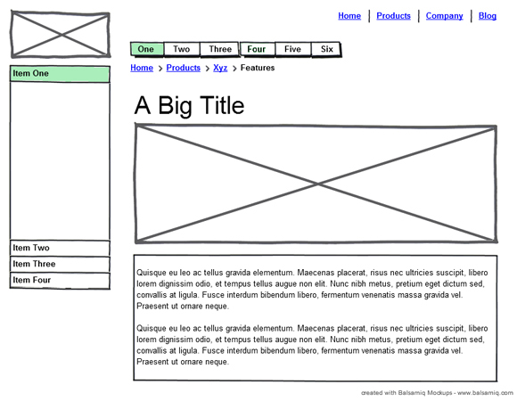
5. Create a logical structure first
If you are a beginner, you are likely to feel the urge to jump into coding without planning much about what you are going to create. This leads to problems once you are half-way and some new changes come. You should always first create a logical structure for how you want to see the page. Even experienced developers at first either go for some sketches or wireframes (while design isn’t present) and then they move to development. So, the process should be something like this:
- Draw the layout (logical structure) first
- Create an HTML structure that will support the layout
- Start working on CSS
A sample layout structure is given below:
6. Organize your CSS-styles, using flags
Let me quote the experts.
“Divide your stylesheet into specific sections: i.e. Global Styles – (body, paragraphs, lists, etc), Header, Page Structure, Headings, Text Styles, Navigation, Forms, Comments, and Extras. [5 Tips for Organizing Your CSS]
/* -----------------------------------*/
/* ---------->>> GLOBAL <<<-----------*/
/* -----------------------------------*/
Separate code into blocks. “This might be common sense to some of you but sometimes I look at CSS and it’s not broken down into “sections.” It’s easy to do and it makes working with code weeks, months, or years later much easier. You’ll have an easier time finding classes and elements that you need to change.
Examples: /* Structure */, /* Typography */ etc.” [CSS Tips and Tricks]
7. Become Familiar With Every Property
While you don’t need to use every property that exists in CSS, it is a good idea to at least know what most of them do. For this, you can take a look at the CSS property reference, from HTML Dog.
8. Use Shorthand CSS
Imagine having to write the following code, if you want to have a different margin for each side of a div.
margin-top: 10px;
margin-right: 24px;
margin-bottom: 12px;
margin-left: 0;
That would take a lot of time every time you want to have something like that applied to a box, right? Thanks to the magic of shorthand CSS, that code can be condensed into a single line.
margin: 10px 24px 12px 0;
Now, that’s much quicker right! Just remember: the order of the sides goes clockwise, from the top. So it’s top, right, bottom, left.
For more on using shorthand CSS, check out this awesome article at Webtint.
9. Avoid Using Inline Styles
By inline styles, I mean the style attribute in the HTML tags. You should avoid using it because it mixes up content and presentation, which can lead to more trouble.
Using inline styles is really almost as bad as using purely presentation HTML elements such as font. It leads to messy code where each HTML file will need to be updated in the event of a style change, instead of a global change in a single external stylesheet.
Bad:
<div style="background:red;">
Ipsum schmipsum
</div>
Good:
.infobox {
   background: red;
}

<div class="infobox">
Ipsum schmipsum
</div>
10. Use an External Stylesheet
Using an external stylesheet is very useful. Put all of your CSS in an external file, and have it included in your HTML. This is probably the best way to be sure to keep content and presentation separate.
Advantages of using an external stylesheet:
- It helps to separate content from presentation.
- External stylesheets can be cached, allowing faster page loading times.
- A single stylesheet can be applied to every page of a site, allowing quick style changes to a single file.
- It makes organization much easier.
To use an external stylesheet, simply place the following code in between your head tags. Be sure to replace style.css with your CSS file.
<link rel="stylesheet" href="style.css" type="text/css" media="screen" />
11. Use a Reset
Most CSS frameworks have a reset built-in, but if you’re not going to use one then at least consider using a reset. Resets essentially eliminate browser inconsistencies such as heights, font sizes, margins, headings, etc. The reset allows your layout look consistent in all browsers.
The MeyerWeb is a popular reset, along with Yahoo’s developer reset. Or you could always roll your own reset, if that tickles your fancy.
12. Keep a Color Reference
I bet this has happened to you many times, when you’re working on a website design and you can’t exactly remember the hexadecimal color code for each element of the design.
A way to fix that is to include a color reference at the top of your CSS file. That way, if you forget the code for a specific color, you can simply check the top of the file, then simply copy and paste it into another section of your file.
/* Colour reference

background: #FFCCCC
normal text: #FFF46D
links: #38FF0E
headings: #77F6FF
main content bg: #DCAFFF

Note: Do not use this color scheme in a real design. It will look horrible.
*/
13. Create Your HTML First
Many designers create their CSS at the same time they create the HTML. It seems logical to create both at the same time, but actually you’ll save even more time if you create the entire HTML mockup first. The reasoning behind this method is that you know all the elements of your site layout, but you don’t know what CSS you’ll need with your design. Creating the HTML layout first allows you to visualize the entire page as a whole, and allows you to think of your CSS in a more holistic, top-down manner.
14. Use Multiple Classes
Sometimes it’s beneficial to add multiple classes to an element. Let’s say that you have a <div> “box” that you want to float right, and you’ve already got a class .right in your CSS that floats everything to the right. You can simply add an extra class in the declaration, like so:
<div class="box right"></div>
You can add as many classes as you’d like (space separated) to any declaration.
Be very careful while using ids and class-names like “left” and “right.” I will use them, but only for things such as blog posts. How come? Let’s imagine that, down the road, you decide that you’d rather see the box floated to the LEFT. In this case, you’d have to return to your HTML and change the class-name – all in order to adjust the presentation of the page. This is unsemantic. Remember – HTML is for markup and content. CSS is for presentation.
If you must return to your HTML to change the presentation (or styling) of the page, you’re doing it wrong!
15. Comment your CSS
Just like any other language, it’s a great idea to comment your code in sections. To add a comment, simply add /* behind the comment, and */ to close it, like so:
/* Here’s how you comment CSS */
16. Understand the Difference between Block vs. Inline Elements
Block elements are elements that naturally clear each line after they’re declared, spanning the whole width of the available space. Inline elements take only as much space as they need, and don’t force a new line after they’re used.
Here are the lists of elements that are either inline or block:
span, a, strong, em, img, br, input, abbr, acronym
And the block elements:
div, h1…h6, p, ul, li, table, blockquote, pre, form
17. Make Use of Generic Classes
You’ll find that there are certain styles that you’re applying over and over. Instead of adding that particular style to each ID, you can create generic classes and add them to the IDs or other CSS classes (using tip #8).
For example, I find myself using float:right and float:left over an over in my designs. So I simply add the classes .left and .right to my stylesheet, and reference it in the elements.
.left {float:left}
.right {float:right}

<div id="coolbox" class="left">...</div>
This way you don’t have to constantly add “float:left” to all the elements that need to be floated.
18. Use “Margin: 0 auto” to Center Layouts
Many beginners can’t figure out why you can’t simply use float: center to achieve that centered effect on block-level elements. If only it were that easy! Unfortunately, you’ll need to use the following code to center divs, paragraphs or other elements in your layout.
margin: 0 auto; // top, bottom - and left, right values, respectively.<span style="font-size: 14px; line-height: 1.5em;" data-mce-style="font-size: 14px; line-height: 1.5em;"> </span>
By declaring that both the left AND the right margins of an element must be identical, the have no choice but to center the element within its containing element.
19. Don’t Just Wrap a DIV Around It
When starting out, there’s a temptation to wrap a div with an ID or class around an element and create a style for it.
<div><h1>Header Text</h1></div>
Sometimes it might seem easier to just create unique element styles like the above example, but you’ll start to clutter your stylesheet. This would have worked just fine:
<h1>Header Text</h1>
Then you can easily add a style to the h1 instead of a parent div.
20. Use Firebug
If you are using Firefox and you haven’t downloaded Firebug yet, stop and go do it. Seriously. This little tool is a must have for any web developer. Among the many features that come bundled with the Firefox extension (debug JavaScript, inspect HTML, find errors), you can also visually inspect, modify, and edit CSS in real-time. You can learn more about what Firebug does on the official Firebug website. Presently Firefox came up with its own debugging tool – so, you can use either of them to have the same purpose.
If you are using Chrome, then you already have awesome Developer Tools that work exactly similar to Firebug.
21. Don’t Underestimate the List
Lists are a great way to present data in a structured format that’s easy to modify the style. Thanks to the display property, you don’t have to just use the list as a text attribute. Lists are also great for creating navigation menus and things of the sort.
Many beginners use divs to make each element in the list because they don’t understand how to properly utilize them. It’s well worth the effort to use brush up on learning list elements to structure data in the future.
You’ll often see navigation links like:
<a href="https://www.innofied.com">Home</a>

<a href="https://www.innofied.com/aboutus">About</a>

<a href="https://www.innofied.com/portfolio">Portfolio</a>

<a href="https://www.innofied.com/contactus">Contact</a>
Though, technically this will work just fine after a bit of CSS, it’s sloppy. If you’re adding a list of links, use an unordered list, silly goose!
22. Avoid Extra Selectors
It’s easy to unknowingly add extra selectors to our CSS that clutters the stylesheet. One common example of adding extra selectors is with lists.
body #container .someclass ul li {....}
In this instance, just the .someclass li would have worked just fine.
.someclass li {...}
Adding extra selectors won’t bring Armageddon or anything of the sort, but they do keep your CSS from being as simple and clean as possible.
23. Use multiple stylesheets
Depending on the complexity of the design and the size of the site, it’s sometimes easier to make smaller, multiple stylesheets instead of one giant stylesheet. Aside from it being easier for the designer to manage, multiple stylesheets allow you to leave out CSS on certain pages that don’t need them.
For example, I might have a polling program that would have a unique set of styles. Instead of including the poll styles to the main stylesheet, I could just create a poll.css and the stylesheet only to the pages that show the poll.
However, be sure to consider the number of HTTP requests that are being made. Many designers prefer to develop with multiple stylesheets, and then combine them into one file. This reduces the number of HTTP requests to one. Also, the entire file will be cached on the user’s computer.
24. Use a master stylesheet
Let me quote this piece of advice from its original source:
“One of the most common mistakes I see beginners and intermediates fall victim to when it comes to CSS is not removing the default browser styling. This leads to inconsistencies in the appearance of your design across browsers, and ultimately leaves a lot of designers blaming the browser. It is a misplaced blame, of course. Before you do anything else when coding a website, you should reset the styling.” [Master Stylesheet: The Most Useful CSS Technique], [Ryan Parr]
master.css
@import url("reset.css");
@import url("global.css");
@import url("flash.css");
@import url("structure.css");
<style type="text/css" media="Screen"> /**/@import url("css/master.css");/**/ </style>
25. Keep a library of helpful CSS classes
Useful for debugging, but should be avoided in the release version (separate markup and presentation). Since you can use multiple class names (i.e. <p>…</p>), make use of them while debugging your markup. (updated) [Richard K. Miller]
.width100 { width: 100%; }
.width75 { width: 75%; }
.width50 { width: 50%; }
.floatLeft { float: left; }
.floatRight { float: right; }
.alignLeft { text-align: left; }
.alignRight { text-align: right; }
Conclusion
We listed 25 important tips which every developer at Innofied follows religiously. Every beginner level developer is handed over a copy of these guidelines and we make sure not a single point is missed while they start writing CSS.
Probably we will not be able to mention all the sources from which we collected such a list of standards but we would like to thank all the designers and developers who shared their ideas and experiences and helped us create a set of rules those are must have for any CSS developer.