Enterprise AI Integration: 4 Hidden Risks That No CTO Can Afford to Miss
What if the real danger to your business in 2026 isn’t your competitors – but your own slow shift to AI? Just look at JPMorgan Chase – the bank now…
Hire AI Agent Developer and Automate the Work You Hate Overnight
The scary part? AI agents don’t just answer questions – they take actions. The scarier part? Your competitors already know this. That’s why “hire AI agent developer” has become one…
AI Integration Consulting: The Smartest Way to Decide Between Custom and Pre-Built AI Models
The moment you start exploring AI integration consulting, the big question hits: should you build a custom AI system or just plug in a pre-built tool? It’s not as simple…
Enterprise AI Development Service: Fix the Gaps That Kill AI Projects
Most businesses don’t talk about it openly, but here’s the truth: you can’t run a 2026 company on old systems and expect AI to magically fix everything. Chris Brahm, senior…
Top 5 Agentic AI Development Company Startups & Enterprises Should Know in 2026
What if your business had an extra teammate who never sleeps, never forgets a follow-up, and quietly keeps your CRM, tickets, and workflows under control in the background? That’s the…
Custom AI Chatbot Development: Fastest Path to AI-Ready CRM & ERP
Let’s be honest – running a modern sales or support operation shouldn’t feel like an endless scavenger hunt across your CRM and ERP. Yet that’s exactly what happens. Your teams…

AI in Fashion Industry: Real-World Use Cases and Key Benefits of Smart Automation
AI in the fashion industry is officially your new BFF, and it’s changing the game fast. According to The Business Research Company, the AI in fashion industry ballooned from $1.26…
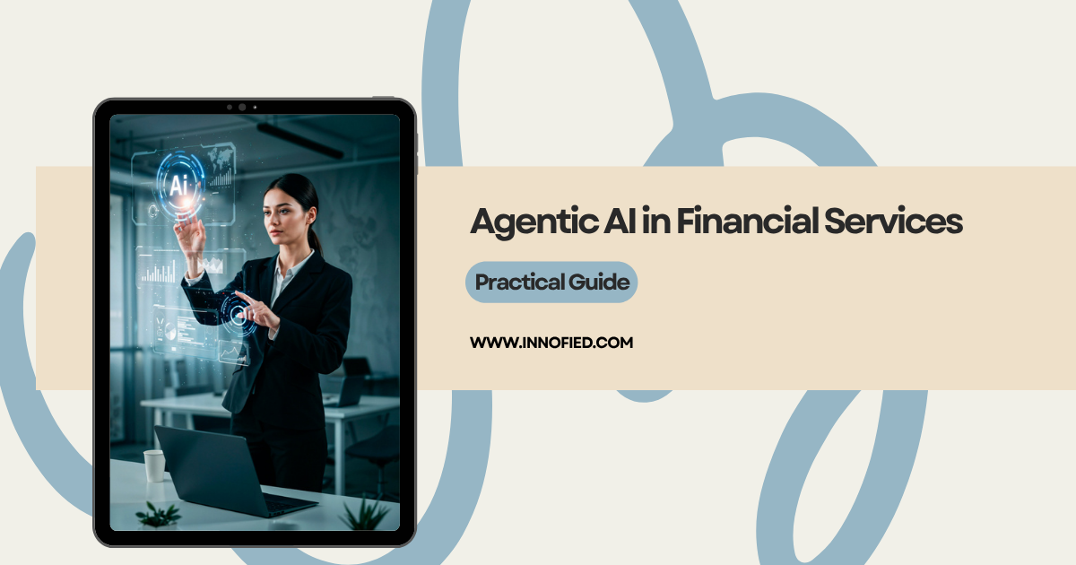
Practical Guide: Agentic AI in Financial Services Can Cut Fraud Losses by Half
Banks and financial institutions are spending billions every year to fight fraud and financial crime, yet according to McKinsey, they are still catching only 2% of illicit money flows. Despite…
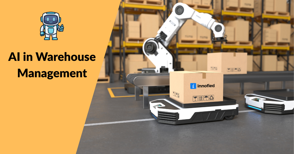
Discover the Benefits of AI in Warehouse Operations & Decision-Making
Artificial Intelligence (AI) is revolutionizing warehouse management, bringing greater efficiency and precision to every aspect of operations. A recent study by Gartner found that 50% of global warehouses will use…
AI in Travel Industry: Key Use Cases, Benefits, and Emerging Market Opportunities
Running a travel business today means juggling too much, manual bookings, back-and-forth emails, late-night customer calls, and tech that barely keeps up. Sound familiar? That’s exactly where AI steps in.…